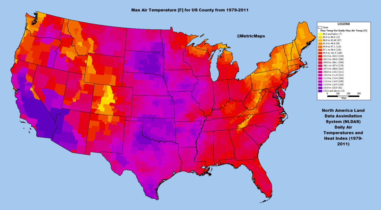
Are you curious about what all of those different symbols on a map represent? You can find out by consulting the map key, or legend. The legend of the map defines the features that are found on that map.
Some map legends can be a little hard to interpret though. Let’s understand how to interpret the legend of the map, and then take a look at some specific examples of maps and map legends.
Understanding The Symbols On A Map – Consulting The Legend
The legend of the map, also referred to as the key of a map, defines the features that are located on that map. This is typically done by displaying an example of a symbol found on the map followed by a description of the phenomenon represented by that symbol. A map without a legend is difficult to interpret, and often useless, and for this reason, you find maps with legends everywhere. Roadmaps have legends, as do subway maps, maps of malls, and even maps found in video games.
Map legends or keys are necessary because maps can be cluttered with many different symbols, and without the legend, the reader may be overwhelmed by the amount of information presented. Examining some real world maps along with their legends will let us understand how map legends are employed to facilitate the understanding of the map. First, let’s look at an image of a map without a legend.
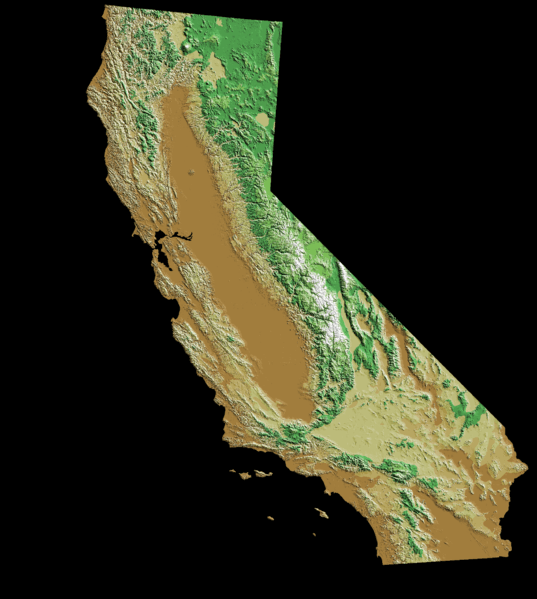
Photo: USGS via Wikimedia Commons, Public Domain
Take a look at the map above. What does this map represent? Without a legend, it’s difficult to say for certain. This is actually a digital elevation map of the state of California, and if you know a little about the geography of California you may have been able to guess this. However, a legend would have made this map much easier to interpret. For this reason, most maps that segment areas into discrete categories will have a legend that defines what those categories represent.
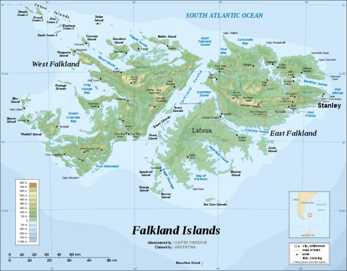
Now let’s look at a map that has a legend to help interpret it. Above is a map of the Falkland Islands. Notice that in the lower left portion of the map there is a bar separated into discrete regions. These regions represent elevation. This conveys the same sort of information as the digital elevation map of California, but now it is much clearer as to what places on the map art which elevation. The dark orange places are at the highest elevation and the light green areas are at the lowest elevation, at least on the landmass. The map also tracks the depth of the ocean surrounding the Falkland Islands.
Looking at this map you might notice something interesting, the map actually has multiple legends on it, not just one. In the bottom right corner, there is a small box that shows how the map delineates roads city is and mountain peaks. Having multiple legends isn’t actually uncommon for maps, and as maps get more detailed it becomes more important to have multiple legends that cover all the different details in the map.
The symbols that cartographers it used to create maps aren’t completely arbitrary, and most mapmakers nowadays will use similar symbols to indicate features on a map. For instance, topographic contours like land elevation are outlined with lines that have a number written above them. Substantial shifts in elevation are reflected with index lines, thick dark lines. Between the index lines, intermediate lines that are lighter in color are frequently found.
The color green is usually used to represent vegetation, and the shade of the color can change in reflection of the thickness of vegetation in that area. Mapmakers also have other methods of distinguishing the thickness of vegetation such as using dotted green regions for areas of scrub brush. Blue regions are used to represent areas of water, like rivers, lakes, and ponds. Just as the concentration of vegetation in an area can be reflected with different colors and shading methods, the concentration of water in a region can be reflected this way as well. Intermittent streams and rivers may be drawn with dotted lines rather than a thick, dark line. Roads are often drawn with long straight lines and marked with text that distinguishes the roads name.
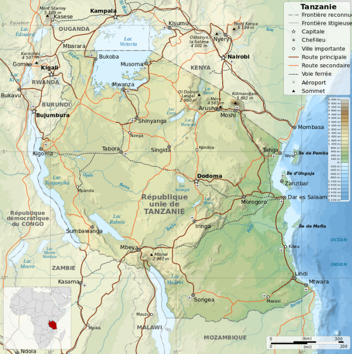
Photo: By © Sémhur / Wikimedia Commons, CC BY-SA 4.0, https://commons.wikimedia.org/w/index.php?curid=6274035
The symbols used to designate features on the map don’t have to follow the standards, but any deviations from these common symbols should be reflected in the maps legend, or else the maps designer risks confusing the reader of the map. Maps also frequently have features that aren’t exactly part of the map’s legend or key, but provide additional information about the map. For instance, the above map of Tanzania has a small region in the lower left corner that shows where Tanzania is in the continent of Africa. The surrounding countries of Tanzania are represented on the map but they are grayed out or given a lighter color to distinguish them as not being the map’s primary focus. Maps also frequently have features like compass roses and a bar that shows the scale of the map.
Different Types Of Maps
Because we’ve taken a moment to understand how to interpret maps, we can now look at some of the many different types of maps out there. Different types of maps are made to convey different forms of information. Some maps display information about the physical world such as elevation climate, while some maps display population or occurrences of a particular phenomenon within a certain region.
Political maps are some of the most common types of maps. Political maps are not concerned with the topographical attributes of the region, such as in the presence of mountain ranges, they are focused only on boundaries at national, state, and sometimes city levels. Political maps traditionally include the presence of notable cities, with the size of represented cities varying depending on the detail of the map.
Physical maps are maps which show the physical, geographical or topographical features of a region. Things like forests, lakes, mountains, and rivers are shown on physical maps. On pure physical maps, areas of green typically denote lower elevations while higher elevation is denoted with brown regions. Topographical maps can be considered similar to physical maps, but unlike physical maps changes in elevation are denoted with contour lines.
Climate maps display information about a region’s climate. They can accomplish this by displaying attributes like temperature, precipitation, the average number of cloudy days, average wind speeds, etc. Climate maps traditionally used different colored areas to develop different climates. For instance, the desert of the American Southwest would have a different color than the Pacific temperate rain forests of the Pacific Northwest.
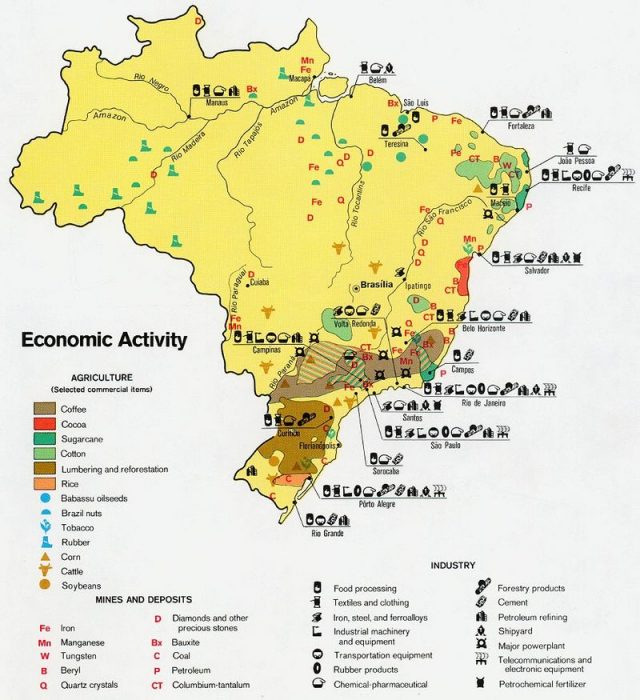
A resource map of Brazil. Photo: Public Domain, https://commons.wikimedia.org/w/index.php?curid=1665157
Resource maps and economic maps chart the level of natural resources or economic activity that are found within a given area. Economic maps/resource maps use varying colors and symbols depending on the exact variables the map is charting. For instance, the production of rice may be shaded one color on a map of Brazil’s economic activity while the production of cotton is likely to be another color. These color regions can be supplemented with symbols for things like the production of corn and soybeans where the range of these production activities is not large enough to merit an entire shaded region.
Roadmaps are probably the most common type of map people see in their day-to-day lives. Roadmaps display major and minor locations throughout an area as well as the routes that connect these points of interest. Places like airports, parks, campgrounds, and important buildings or monuments are noted on the map, with both major and minor roads and highways displayed, so that the reader of the map can chart a route between two places. Significant highways and roads are typically displayed in red and are thicker than other roads surrounding them, which are usually depicted using narrower lines. As an example, a roadmap of California would show state highways in narrower lines than the interstate highways that run the course of the state and are typically depicted in bold red or yellow lines. Country roads, significant arteries, and rural roads are often depicted in shades of white or gray.
A thematic map is a map made to present interesting findings revolving around a specific topic or theme. Thematic maps won’t typically give much consideration to natural features of an area like elevation, the presence of political subdivisions, cities, rivers, or highways. These are not the primary focus of the thematic map, and if they are included they are included as background information. One example of a thematic map is this map of Vancouver Canada and the surrounding area, which shows how the region experienced changes in population between 2011 to 2016. Red areas represent an overall population loss while green areas represent population growth.
Similarly, this list of different maps shows linguistic differences between areas of the US, how different regions of the United States pronounce words or have different terms for the same concept. Different colors are used to represent the different ways people pronounce words or the different phrases they use, and as an example, red could be used to represent parts of the country where people say “tennis shoes” while blue represents regions where people say “sneakers”.


